Design
PNG to SVG: How to Get Clean Vectors (Not Messy Paths)
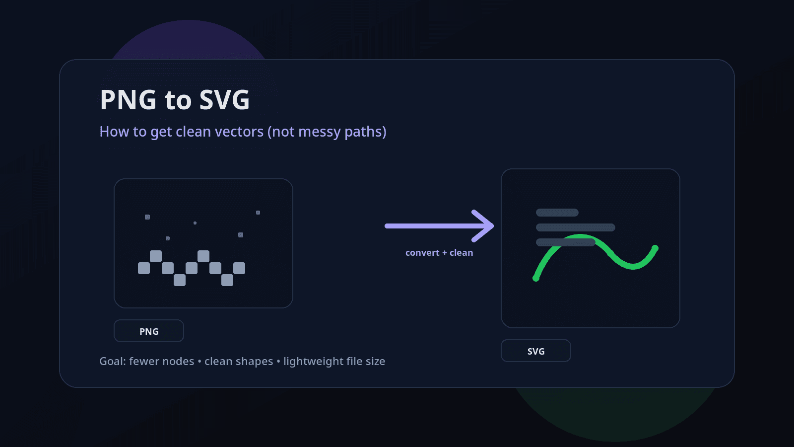
PNG to SVG: How to Get Clean Vectors (Not Messy Paths)
If you’ve ever converted a PNG to SVG and opened the result… you know the pain:
Thousands of tiny points
Wobbly edges
Random speckles
Heavy file size
Shapes that are impossible to edit
The truth: most “PNG → SVG” tools don’t create clean vectors. They create a traced outline of pixels — which is why you get messy paths.
This guide shows a practical workflow to get clean, editable SVGs (logos, icons, illustrations) without path chaos.
Why PNG → SVG often becomes messy
A PNG is made of pixels. Vector paths are smooth math curves. When a converter “traces” a PNG, it tries to draw outlines around pixel regions. If your PNG has:
low resolution
compression artifacts (JPEG-like noise)
gradients and shadows
fuzzy edges
too many colors
…the tracer has to “guess” boundaries and it creates a ton of tiny segments.
Clean SVG is not just “conversion.” It’s preparing the image, tracing the right way, and cleaning the output.
Step 1: Use the right PNG (this matters more than the converter)
Before converting, check your PNG:
Best PNG types for clean SVG
✅ Logos, icons, flat illustrations
✅ 2–8 solid colors
✅ Sharp edges
✅ Transparent background (ideal)
PNG types that usually trace badly
❌ Photos
❌ Heavy gradients / glow / shadows
❌ Text inside the image (often becomes jagged)
❌ Low-res images (like 256px icons scaled up)
Rule of thumb: if you zoom your PNG to 400% and the edge looks fuzzy, the SVG will be worse.
Step 2: Clean the PNG before converting (5-minute fix)
Do these quick fixes before tracing:
A) Increase resolution (if needed)
If your PNG is small, upscale it first (2x or 4x).
More pixels = smoother edge detection = fewer jagged curves.
B) Remove noise & artifacts
Even slight noise creates hundreds of tiny blobs in SVG.
Apply denoise (light)
Apply sharpen (light)
Avoid heavy smoothing (it distorts edges)
C) Remove background properly
A background that looks “white” often isn’t pure white.
If possible:
Use a tool to remove background cleanly
Export PNG with transparent background
D) Reduce the number of colors
This is the biggest win.
If your PNG has 50+ colors, tracing will create layered chaos.
Try reducing to:
2 colors (logos, icons)
4–8 colors (simple illustrations)
You can do this with a “posterize” effect in any editor.
Step 3: Choose the right SVG conversion method
There are two main approaches:
Option 1: Auto-trace (fast, needs cleanup)
Best for: icons, logos, flat art
The tracer creates paths based on color regions.
Use this when you want speed.
Option 2: Rebuild as vector (slow, cleanest)
Best for: important brand logos, professional prints
This is manual vector design (Pen tool).
If you want perfect output for a logo, this is the gold standard.
Most people need Option 1, but done correctly.
Step 4: Trace settings that produce cleaner paths (the “not messy” setup)
If you’re using a typical tracer, aim for:
A) Fewer colors = fewer layers
Set “number of colors” low (2–8).
Avoid “full color” tracing unless you’re okay with large SVGs.
B) Higher threshold (for black/white)
For logos or line art:
Increase threshold so edges become clean and bold
Reduce speckles
C) Enable smoothing (but not too much)
Smoothing helps reduce zig-zags.
Too much smoothing deforms corners.
D) Reduce corner nodes / simplify
If your tool has:
“simplify paths”
“optimize”
“reduce nodes”
Turn it on. This is how you avoid “spaghetti SVG”.
Step 5: The real secret — clean the SVG after conversion
Even good tracing often leaves extra junk. After conversion, do this cleanup:
A) Remove tiny specks
Zoom in and look for random dots or micro-shapes.
Delete anything that shouldn’t exist.
B) Combine shapes where possible
Many tracers create separate shapes for areas that can be merged.
Merge same-color shapes
Remove overlapping duplicates
This reduces file size and makes editing easier.
C) Simplify path nodes (without breaking shape)
If a curve looks smooth but has 500 points, it’s bloated.
A clean icon shape often needs:
20–150 nodes (depending on complexity)
Not 5,000.
D) Convert strokes carefully
If your SVG has strokes:
Decide if you want strokes as strokes (editable)
Or strokes converted to outlines (stable for export)
For logos/icons, outlines are often safer for consistent output across apps.
Step 6: Test your SVG the right way (quick quality checklist)
Before you upload or use it anywhere:
✅ Zoom test: at 800% edges should still look clean
✅ Edit test: you can move shapes without breaking everything
✅ Size test: file size is reasonable (icons should be KBs, not MBs)
✅ Fill test: colors should be simple and grouped
✅ Compatibility test: open in a browser + design tool
If your icon SVG is 800KB, something went wrong (too many nodes or too many colors).
Clean PNG to SVG workflow (copy-paste checklist)
Use this exact flow:
Start with a clean PNG (sharp edges, simple colors)
Upscale if low-res (2x or 4x)
Remove background (transparent if possible)
Reduce colors (2–8)
Trace with low colors + smoothing + simplify
Remove specks / merge shapes
Simplify paths (reduce nodes)
Test in browser + editor
This is how you get clean vectors, not messy paths.
Common mistakes that create messy SVGs
Mistake 1: Converting a photo to SVG
Photos should stay raster (PNG/JPG).
SVG photos become huge and ugly.
Mistake 2: Tracing gradients
Gradients create many color bands and layers.
If you need gradients, recreate them as vector gradients after conversion.
Mistake 3: Using “too many colors”
More colors = more shapes = bigger SVG + harder editing.
Mistake 4: Ignoring post-cleanup
Tracing is step 1. Cleanup is step 2.
A faster way: Generate clean SVG-style artwork directly
If your goal is brand-ready SVGs (icons, illustrations, designs), starting from a PNG is often the harder path.
You can skip the mess by generating vector-style outputs directly using an AI SVG workflow.
If you want to try that, start here:
AI SVG Generator (pillar): https://svgverseai.com/solutions/ai-svg-generator